Case study
Global energy dashboard
An interactive Vega-Lite project that turns several energy datasets into linked comparisons across countries, continents, and time.
The problem
Energy datasets are broad enough to hide their own story. Access to electricity, per-person consumption, renewable generation, and GDP all move differently across countries and time.
I built a browser-based dashboard that lets someone compare those dimensions without reading a raw table first.
What I built
The project uses Vega and Vega-Lite for four different views:
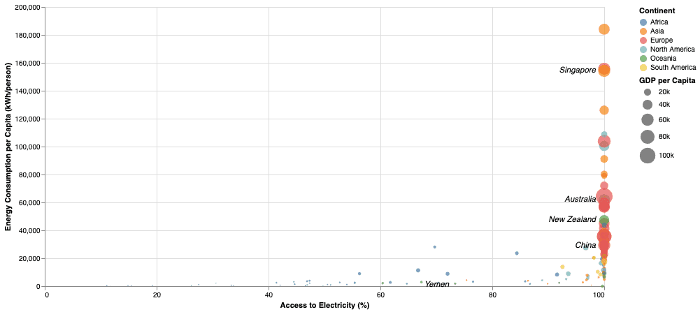
- A scatter plot comparing electricity access with energy use per person
- A choropleth showing annual changes in renewable generation
- A parallel-coordinates view comparing normalised continent-level metrics
- A stacked area view for GDP per capita over time
The scatter plot encodes continent by colour and GDP per capita by point size. The time-based views include play and pause controls so a reader can watch the data change rather than dragging through each year manually.
Data preparation
The source data did not arrive in one clean shape. I used scripts and intermediate CSV files to filter, merge, and augment the datasets before the visualisations consumed them.
That separation mattered. The Vega specifications could stay focused on visual encoding instead of carrying every cleanup decision inside the chart definition.
Interface choices
Each chart includes a plain-language explanation of what its axes and marks mean. This was important because a technically correct visualisation is still weak if the reader cannot tell what to look for.
I also used animation only on views where time is part of the question. The parallel-coordinates view stays static because motion would not add meaning there.
What I would improve now
The page needs a tighter editorial pass. Some explanations are too long, the layout could adapt better on small screens, and the charts would benefit from a shared filtering model.
I would also move data preparation into a documented build step so the published dashboard and its source datasets are easier to reproduce.